Is the font seen on the screen shots temporary or final? Personally I find it a bit silly.
The UI looks really slick and it does not match up IMO.
Font

Re: Font
I initially had a similar opinion of the font, but I have since gotten used to it.
I'd be curious to hear other people's opinions on the subject.
I'd be curious to hear other people's opinions on the subject.
Re: Font
It looks a little bit off to me personally, it's not a bad font persay, but it doesn't quite gel with the art style or the UI elements. Something closer to the font in the logo but with a little less stylization and skewed more toward standard block than wide block lettering would match the UI bordering and art elements IMO. The strait lines and rounded corners look closer to how the UI borders do right now.
-
luciderous

- Posts: 58
- Joined: Mon Feb 02, 2015 8:17 am
- Location: Ukraine, Kyiv
Re: Font
I actually do like the font used for titles ("Select Faction", names of the races etc.) -
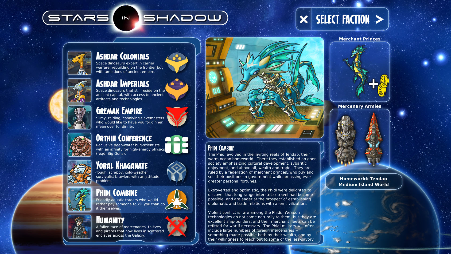
It's quite nice and blends well with the visual style of the game overall. The problem is, however, that it seems to be a bit inconsistent with the other font used for titles throughout the UI (ship type names for example). Nothing major of course, but it may benefit from some further tuning.
It's quite nice and blends well with the visual style of the game overall. The problem is, however, that it seems to be a bit inconsistent with the other font used for titles throughout the UI (ship type names for example). Nothing major of course, but it may benefit from some further tuning.
Re: Font
luciderous wrote:The problem is, however, that it seems to be a bit inconsistent with the other font used for titles throughout the UI (ship type names for example).
Right. It's the inconsistency that jars slightly. Nothing major, and purely a cosmetic detail, but something to consider nonetheless.
-
cacysunlee

- Posts: 6
- Joined: Thu Feb 12, 2015 11:30 am
- Location: Germany
- Contact:
Re: Font
I mean only the headlines, for example in the race selection. This font reminds me a bit of comic books. The other letters looks fine. 
Imho space games looks better, when they are have some modern art font. And the font in the banner of the forum does look like a font for a space game.
Imho space games looks better, when they are have some modern art font. And the font in the banner of the forum does look like a font for a space game.
my hobby is game design with C# and Unity3D.
and I still need to practice English...
and I still need to practice English...
-
luciderous
- Posts: 58
- Joined: Mon Feb 02, 2015 8:17 am
- Location: Ukraine, Kyiv
Re: Font
cacysunlee wrote:This font reminds me a bit of comic books.
Is there something wrong with comic books?

cacysunlee wrote:Imho space games looks better, when they are have some modern art font. And the font in the banner of the forum does look like a font for a space game.
Tastes differ. Personally, I like current font quite a lot. And the font you are suggesting for a replacement is a bit to 'arty' for my taste, to the point of being unreadable with larger chunks of text. Oh well, maybe that's just me?
Re: Font
luciderous wrote:cacysunlee wrote:This font reminds me a bit of comic books.
Is there something wrong with comic books?cacysunlee wrote:Imho space games looks better, when they are have some modern art font. And the font in the banner of the forum does look like a font for a space game.
Tastes differ. Personally, I like current font quite a lot. And the font you are suggesting for a replacement is a bit to 'arty' for my taste, to the point of being unreadable with larger chunks of text. Oh well, maybe that's just me?
Nothing wrong with comic books, and there's nothing wrong with the font by itself, but it doesn't really match with the text font or the UI design. It'd be one thing if they were using angles and lines that were consistent with the font's style. From a visual design standpoint the font looks disconnected from the elements around it and it's being used in the most prominent possible way, so people are picking up on it at a glance. This effect can be used in different ways, but if you're doing it you need to have it convey something or draw attention to something you want attention on. Right now all I'm getting is 'this font looks different' because it does, maybe that will change when eventually I get to see the game in action, but for now the only message is 'this font looks different', which is jarring and doesn't lead to any deeper message.
Overall it's a completely minor point though, and fonts are easy to change.
The UI you posted does indeed look boring, but not because of the font they used, it looks boring because it's dark gray, and flat. From what we've seen of Stars in Shadow the UI uses colors and translucency to convey depth, you could use comic sans (shudders) and the UI would still look good, people would just complain about the font ;P
-
cacysunlee
- Posts: 6
- Joined: Thu Feb 12, 2015 11:30 am
- Location: Germany
- Contact:
Re: Font
Please don't get me wrong, nothing is wrong with Comics, i love the universe of Stan Lee, but i full agree with Hakon.
my hobby is game design with C# and Unity3D.
and I still need to practice English...
and I still need to practice English...

Re: Font
I would also say that the font fits well with the graphics style of the entire game, not only the UI.
I would also agree that there is a slight collision in stayle when comparing the headlines font to the main text font. It is only slight, but noticable.
Maybe changing the main text font to somethign that fits better to the headlines font would be the best way to solve the issue (its not a problem)
I would also agree that there is a slight collision in stayle when comparing the headlines font to the main text font. It is only slight, but noticable.
Maybe changing the main text font to somethign that fits better to the headlines font would be the best way to solve the issue (its not a problem)
-
cacysunlee
- Posts: 6
- Joined: Thu Feb 12, 2015 11:30 am
- Location: Germany
- Contact:
Re: Font
I agree, it's not a problem. In my games are cosmetics one of the last things, that i do. Bug hunting and fixing have the major priority in beta stages.
my hobby is game design with C# and Unity3D.
and I still need to practice English...
and I still need to practice English...
Re: Font
halftea wrote:On a related note, is there a reason that the two "A"'s in the title on the main webpage and the forums are different?
Artistic license. The A in the word "stars" has a star, and the A in the word "shadow" does not.
Who is online
Users browsing this forum: No registered users and 14 guests